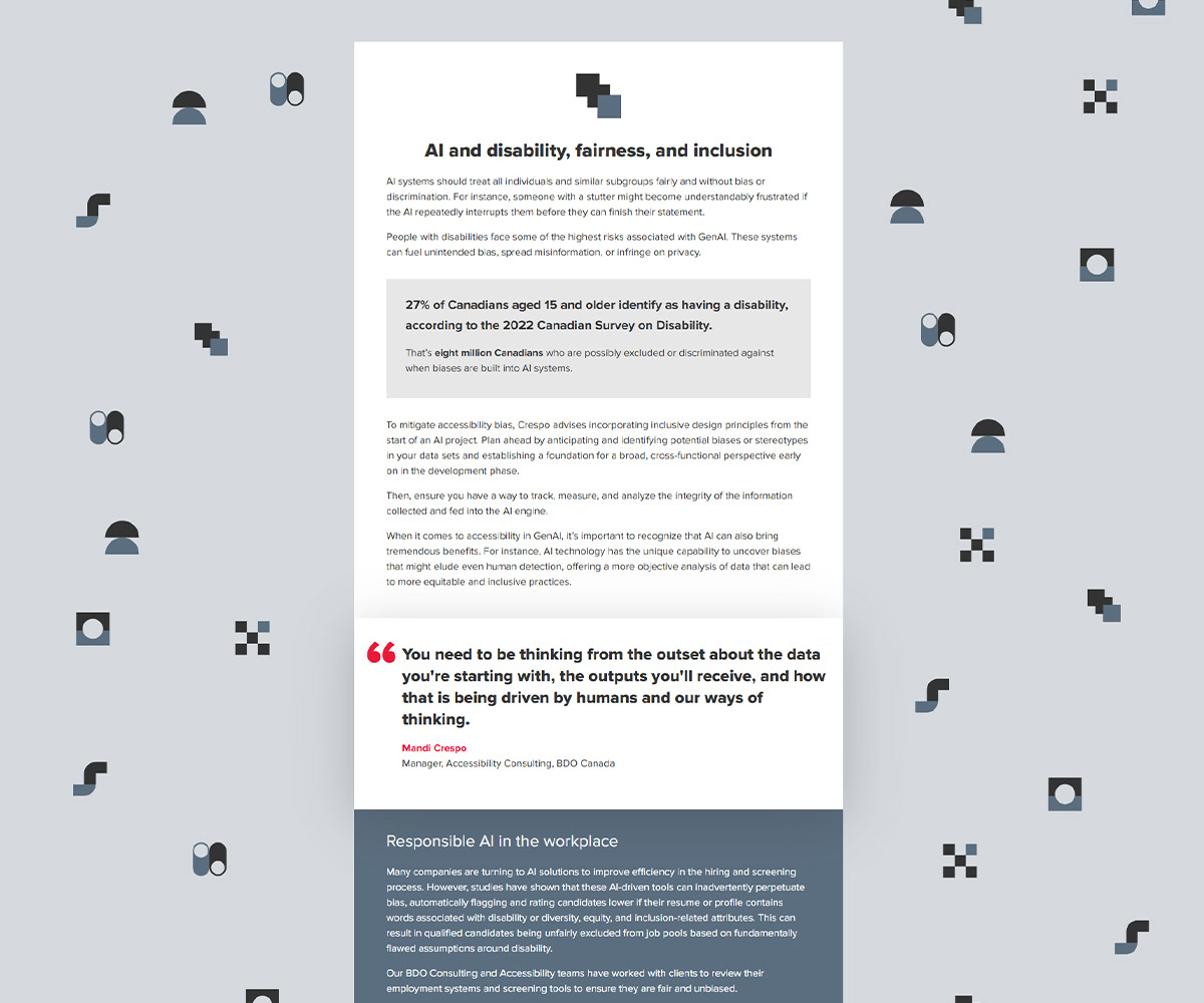
Responsible AI Guide: A comprehensive road map to an AI governance framework
Super long form web report that focuses on AI implementation in a responsible way. (BDO, 2024).
Collaborated with content writer and marketing team to ensure information was represented in the best way for audience interpretation. All design concepts were developed by me using the BDO brand.
This piece performed quite well with many viewers reading well into the report. I think the way the content was displayed helped showcase the interesting, topical subject matter.
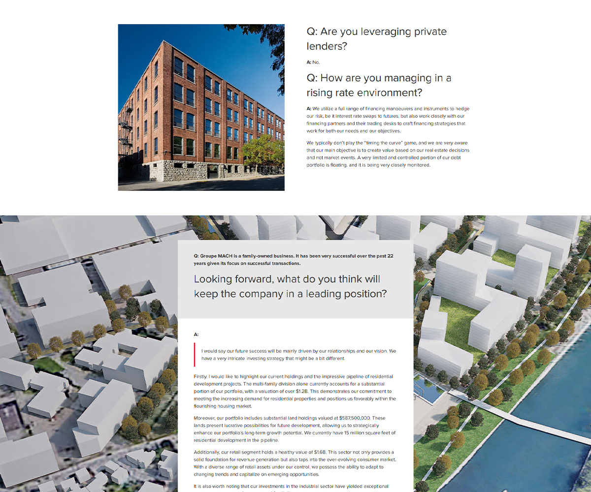
Innovative real estate ventures
Long form article created in collaboration with Groupe MACH. (BDO, 2024)
The challenge with this article was to incorporate architectural imagery without affecting the readability (i.e. it being too long on mobile).
I focused a lot on the Q&A style of article and emphasized the questions to try to gain attention for a reader who my be skimming through the article.
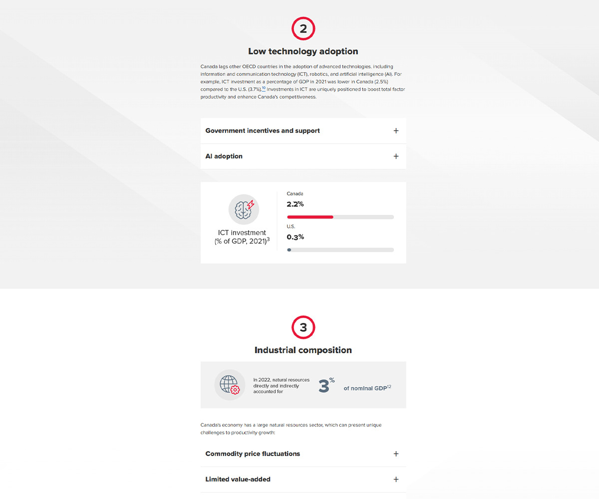
Canada’s productivity paradox
Super long form web report that outlines the productivity crisis in Canada. This also involved the incorporation of interactive infographic elements. (BDO, 2025)
This report was the flagship piece in a campaign, so it began with concept creation. My idea to show productivity was through the idea of reflections, for example, one person doing the work of two. This worked well with the overall productivity concept, but also with some of the solutions that would be clear through other articles in the campaign (i.e. use of AI, efficiencies, etc).
This report was a challenge to produce due to sheer amount of content, and the variety throughout. I aimed to develop repetition throughout the report to help guide the reader. Strong chapter sections, good navigation and a flow that helped guide the reader to the most significant content. Despite its length, this piece had quite strong analytics with many visitors spending a lot of time on the page.
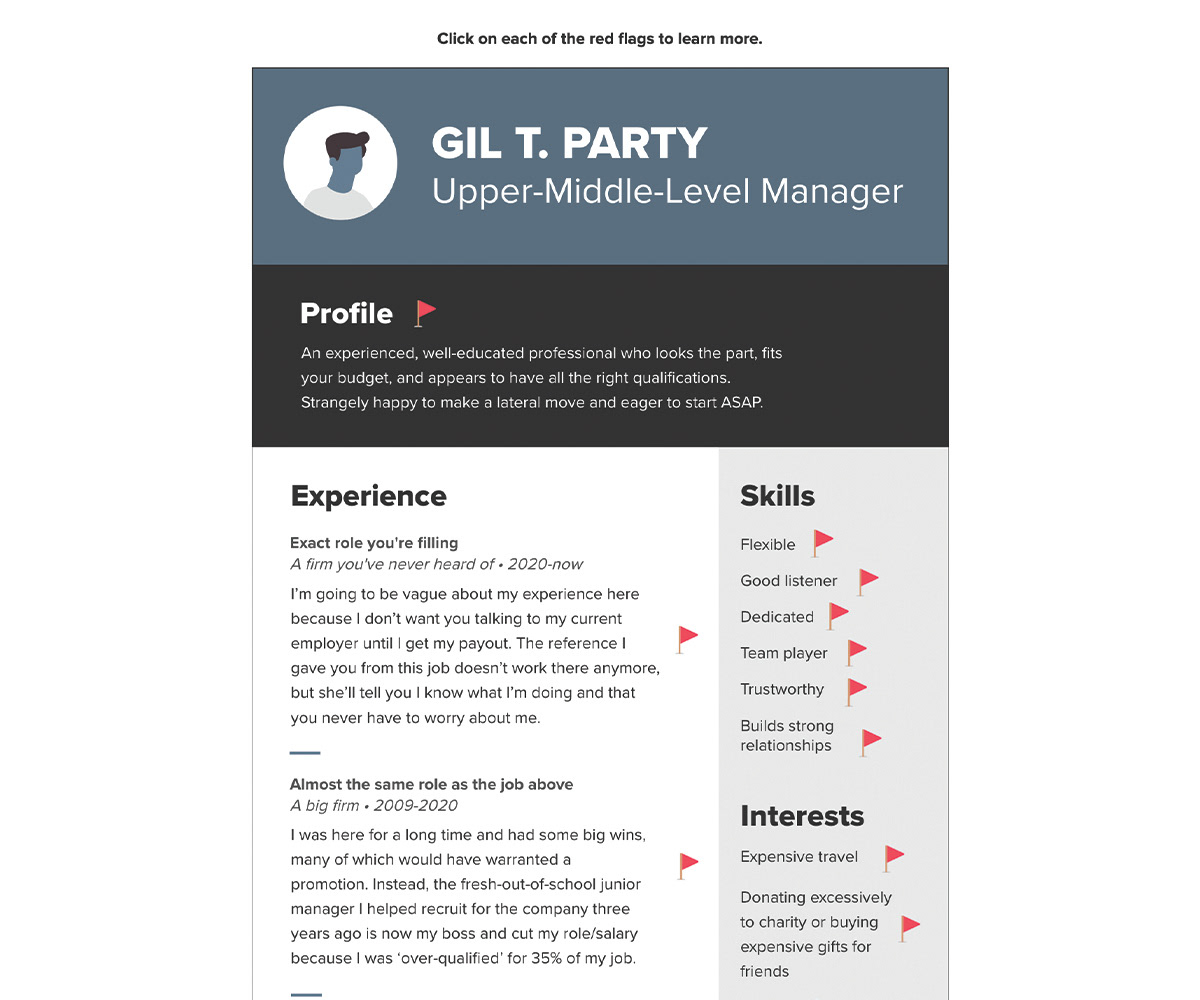
Resume of a Fraudster
Interactive Infographic about employee fraud. (BDO, 2019)
This is one of my favourite pieces I've designed. The concept was to show a resume of someone who was a fraudster. In my concept development, I decided to use the actual red flag emojis because its something that many people are quite familiar with. I thought it was a great way to call out the content and because the actual flag content is hidden, allows you to guess why a seemingly simple characteristic could be a red flag.
This piece continues to perform well and is revamped every year as a part of our Fraud Awareness Month campaign.
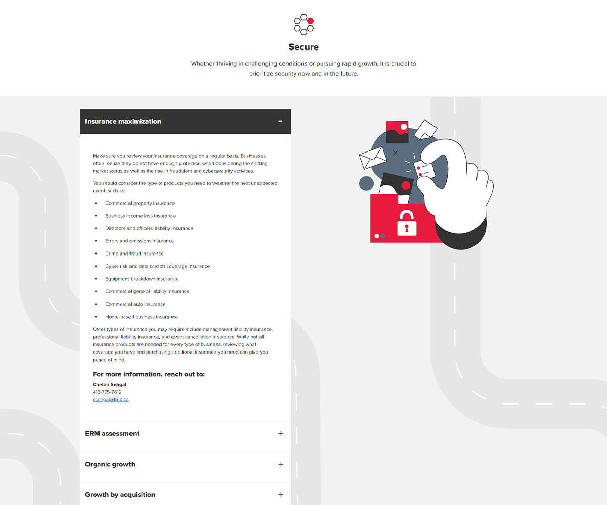
Navigating business growth
Roadmap infographic article to help entrepreneurs with business decisions. (BDO, 2024)
This piece was a revamp of a similar piece geared towards entrepreneurs and how BDO can help, depending on their needs. The original idea was to keep this as a roadmap, but with accessibility and user experience, I ended up creating something a little simpler in terms of navigation. Viewers can still jump around the piece to focus on the areas that are relevant to them, but its much more user friendly, mobile friendly, and clear and concise.
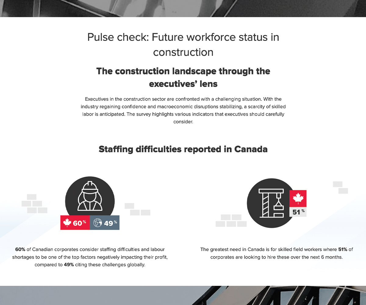
Reshaping the construction industry for Gen Z
Infographic article summarizing a longer print report. (BDO, 2023)
This piece came to life after we launched our new website which came with a much bigger focus on accessibility, mobile friendly design and an overall cleaner look and feel. Because this piece had some great stats, I tried to find nice ways to showcase them as callouts while keeping the viewer experience strong. I think this piece ended up being organized well and an interesting read.